Serif or San Serif? Big, bold, restrained, or classic? An official product shot or a User-Generated Image? In the fast-paced world of digital marketing and product development, you have a
In today’s fast-paced digital world, the average website visitor possesses an attention span of a mere 8 seconds. Yes, you read that right—just 8 seconds! In this blink-and-you-miss-it era, capturing
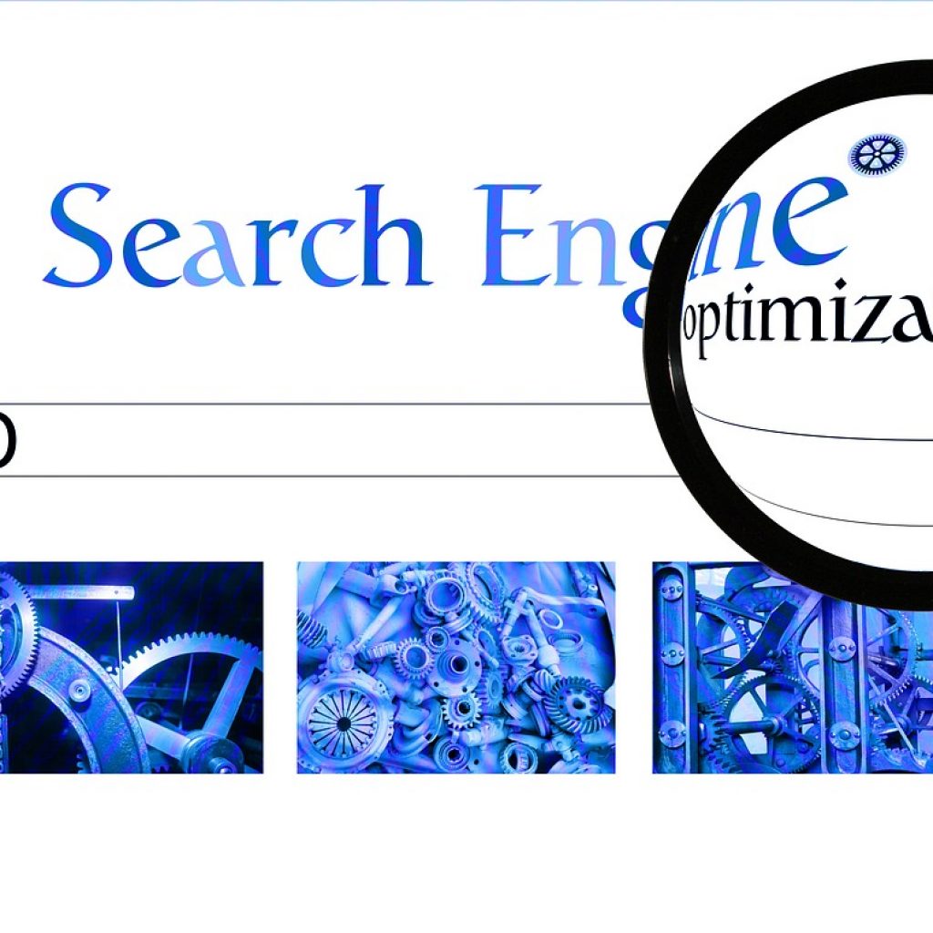
When it comes to learning Search Engine Optimization (SEO), do not believe everything you read on the web. Many SEO myths persist that Premiere Creative experts are ready to debunk.
Nowadays, the average online customer expects nothing less than quick loading times and a seamless page experience to discover the best products or services on the web. In a world
You’ve probably overheard the term “orphan pages,” among other digital marketing jargon. Mastering the inner workings of website optimization remains paramount for any small to mid-sized business hoping to increase
For businesses looking to broaden content marketing efforts, owning a tightly organized website-structure can boost SERP results. One of the advanced SEO techniques that website owners should consider involves creating
With the perpetual changes occurring in the digital marketing and advertising industry, it can feel challenging to keep up or prepare for new surprises lurking around the corner. Staying informed
A new decade means a boatload of new trends shaping the digital marketing landscape. Some trends stem from existing technology and techniques while new updates allow emerging trends to gain
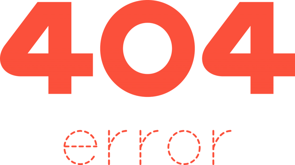
We’ve all come across them. Those error messages that read “Error 404” or “404 Page Not Found.” Annoying, right? Although common, these pesky 404 error pages cause frustratingly bad user
Speed is a killer. Website visitors have unrealistic expectations regarding lighting fast loads. Time, like money, but be explicitly managed or you can lose prospective customers before they even get